
|

|
IllustrationOverviewTitle:
Size: Medium: Watercolor and Ink Completion: February 2023 Exhibition TextThis piece was inspired by Alphonse Mucha and the Art Nouveau movement. The contrast between the two works comes from the colors that were used in each piece. This piece is reflective of important parts of my identity,
|
Inspiration
|
This piece is meant to reflect on two characteristics that I have. One is the tendency to self sabotage and the other is the potential that I have if I didn't do that to myself. The inspiration for this piece was to paintings from the Art Nouveau movement by Alphonse Mucha. The guidelines for this piece were to create two illustrations that had obvious contrast between each other still appeared related, and to recreate a piece from art history with figures that looked out of place or modernized. At first I thought that I was limited by the amount of restrictions that were implemented in this piece, but than I was inspired by Alphonse Mucha. I saw these pieces by Alphonse Mucha and I saw an opportunity to create contrast using colors and symbols. I wanted this piece to explore my identity. This piece is an exploration of my own tendency to self sabotage and how often times I am my own worst enemy, but I also wanted the viewer to be able to see themselves in this piece as well.
|

|

|
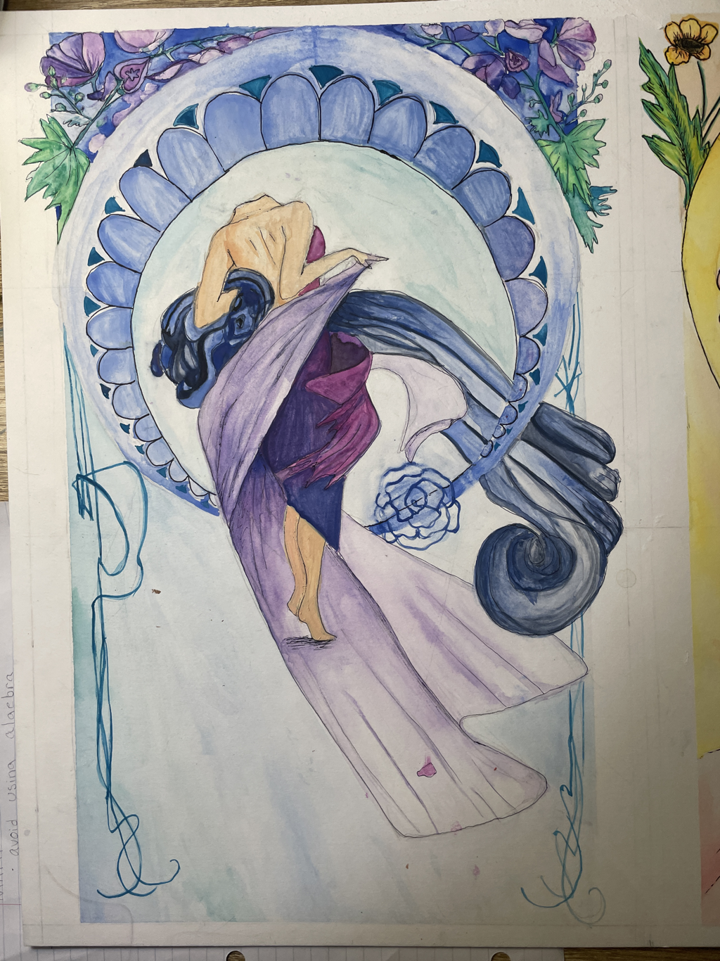
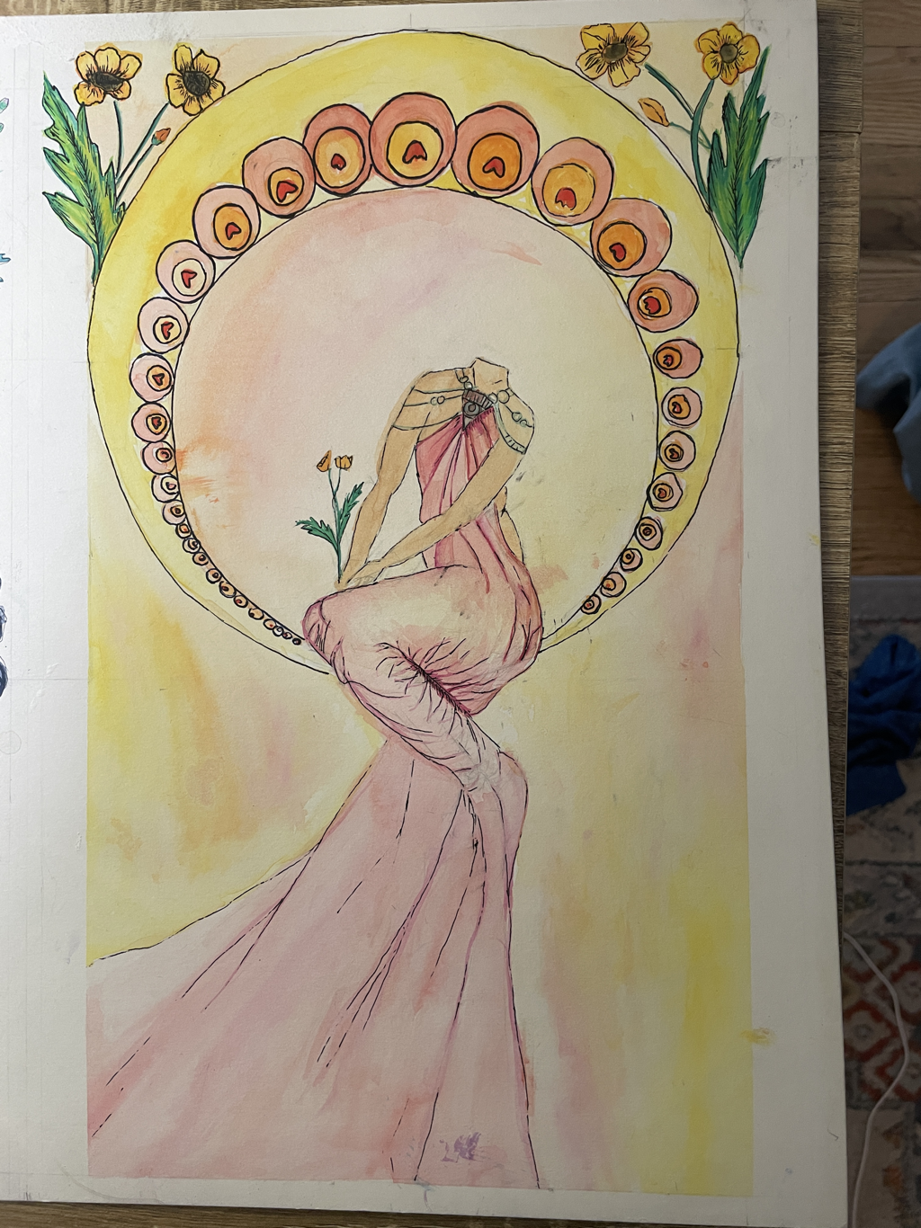
Because of this, and the need to make the figures appear out of place, I decided to make the subjects of these paintings headless, This way the viewer can see themselves in the piece and determine what it means to them as well.To create contrast between the two paintings I decided to use color. This was originally decided by the flowers I decided to use in the top corners of my pieces. For the "evil" one I wanted to use two flowers from the buttercup family. These two flowers are aconite, which is purple, and the common yellow buttercup. I decided that the left image would be recreated with cool colors, to match the purple aconite, and the right image would be made using warm colors but primarily yellow and pink. Because I wanted this image to have a "good vs evil" effect, with one side representing the "evil" in blue's and purples. and the other side representing "good" with the light yellows and pinks.
|
Planning
|
For the planning of this piece I wanted to create contrast by using color. I didn't want the piece to appear "dark" vs. "light", so I wanted to use warm vs. cool colors. I also planned on using the different meanings behind the objects to create contrast. I decided to do this by using two different flowers in the top corners above the circle around the figure. The flowers that I chose were aconite and buttercups. I chose these flowers because they have naturally contrasting colors and they are from the same family. Aconite is a deep purple color and buttercups are a bright yellow. They also have very different meanings. Buttercups are known as a symbol of happiness, innocence and childhood, as well as overall positive things. Aconite, well it comes from the buttercup family, is poisonous and thus is a symbol of poison, sickness and death.
|

|
Process
|
For this piece I needed to make sure that the circles in both pieces were the same dimensions, so that the pieces would unquestionably appear related. To make sure that they were identical I used a process that I learned from an earlier piece called diagramming. This allowed me to create two squares that were the same dimension, and find the middle by drawing two lines from corner to opposite corner. I then drew lines from the midpoint to the edge of the square and measured it. This gave me the measurement of the circles radius. I then recorded this distance on the diagonal lines. After making enough marks along the radius' distance from the center point I was able to connect the dots to form to about equally sized circles.
|

|

|
I then began working on the side that I wanted to represent "evil". This side has aconite in the corners which is a poisonous flower in the buttercup family. I liked the idea of using aconite on one side and buttercups on the other. This would create the desired contrast between the yellow and the purple flowers. I began by sketching out the desired look of the aconite flowers. I did this process on both corners, making them similar but not exactly identical in order to ensure some visual variety.
|
|
After I repeated this process on both sides I began to sketch out the main subject of the painting. However before that I repeated the same process in making the circles in order to make two smaller circles inside of the larger one. The circles needed to be centered around the center of the original circle vertically, but also located with the circumference touching the bottom of the large circles. To do this I repeated the diagramming process that I did with the larger circle. After I had completed diagramming the circles I began to sketch out the figure in the center of the painting. Although she is wrapped in fabric I still began with sketching her figure so that the fabric would accurately fall and drape across her body. Drawing the fabric accurately was a difficult process, but I refrained from using shading until I was able to add color using the paints. Although it was not my intention to include the head and face of the figure in the final piece I drew it anyway in order to use that in my dimensions. Without drawing the head the entirety of the figure was out of proportion, so I decided to erase the remaining parts later.
|

|

|
After I was satisfied with the results of the sketch, I began the painting process. The goal of this process was to use primarily cool colors, as well as avoid using very yellow greens and very red purples. Well I included some shades of these colors it was for the sake of details and contrast from the other forms around it.
|
|
I began by painting the flowers in the top to corners. Rather than do a wash of background color I painted the flowers and leaves first. This turned out to be a mistake when I went back and added the dark blue background. Although this worked out for this piece I made sure to use a different strategy when doing my next one. Having learned from my mistakes from the corner sections of this piece I began by adding a wash of color over the entire background in a light blue color. I included a variety of different colors in the background because it added more interesting visual definition to the piece. I then began painting the fabric of the dress. I varying shades of purple and blue in this piece because I wanted the viewer to be able to differ between the fabrics that the figure was wearing. For the bottom dress I made it gradient of reddish purple to dark blue. For the longer piece of fabric draping from her hand I chose a light shade of purple. For large amount of fabric that she has bundled up in her left arm that flows off the page I used a darker shade of blue mixed with black. I added highlights by using more water when painting and the opposite for the shadows.
|

|

|
After I finished with the fabric I began to work on the other circle, by filling in the circle with the same color combination that I utilized in the rest of the background. I also used a similar color in the designs in between the two circles that created the frame around the figure. At this point I was unsure if I was going to add more designs like my inspiration piece had. To keep my options open I used a shade of blue that I felt was dark enough to create contrast but still light enough to go back in and add more designs if I felt it was needed. After I had finished up the skin tone and added finishing touches like the lines on either side of the figure I went back in and lined al the major lines with the thinnest pen that I had. I felt like this still may have left it a little to light so I went back in and used a larger pen to add the final details to this piece. I also added a rose to the bottom of the circle to hide a large blue smudge that I made with my hand well painting. After I finished that I decided to leave the piece alone for now and begin working on the next one.
|
Experimentation
For this piece I experimented with many different options in order to get the desired result. The first thing that I experimented with was what paint I should use. I considered using gouache because it would allow me to have more opaque colors and slightly more control over the paper that I was using. Ultimately I decided to use watercolor because I found that the flow of the water and the more translucent aspect would better reflect my theme and was more intuitive for me as an artist. Another aspect that I experimented with was the amount of water to use on my brush. The more water the less opacity the brushstroke has. This was an easy way to control the shadows and the highlights. Because watercolor doesn't use white, and rather uses the white of the paper I used this technique to maintain the highlights and the shadows, particularly on the flowers and the fabric.
Critique
|
|
|
|
Similarities
|
Differences
|
ACT Connections
1.) Clearly explain how you are able to identify the cause-effect relationships between your inspiration and its effect upon your artwork:
Their is a strong relationship between my piece and my inspiration which is seen in the nature of my piece and the forms that I used.
2.) What is the overall approach ( point of view ) the author ( from your research ) has regarding the topic of your inspiration?
The perspective that the author has on the topic of my inspiration is one that is very knowledgeable and informed, which is beneficial in the acquisition of the knowledge that I have of these pieces.
3.) What kind of generalizations and conclusions have you discovered about people, ideas, cultures, etc. while you researched your inspiration?
I learned from my inspiration that the way art can transcend movements and have relevancy generations later.
4.) What was the central idea or theme around your inspirational research?
The central idea or theme around my inspirational research was to discover an artist that was able to bring close attention to similar elements as I did and create works that have the ability to express the themes that I bring to my work.
5.) What kind of inferences did you make while reading your research?
An inference that I made while doing my research was that artists do not always have to do work in the same medium in order to be a source of inspiration.
